Marathon Devs Embrace “Fontslop” as UI Backlash Explodes After Server Slam
Marathon’s Server Slam wrapped yesterday, and the results were… complicated. The game peaked at 143,621 concurrent players on Steam, a massive number for a pre‑launch test — but instead of climbing over the weekend, the player count dropped by nearly half. And while players had plenty to say about TTK, inventory friction, and the usual extraction‑shooter chaos, one complaint drowned out everything else: the UI.
Not just “the UI is bad.”
Not just “the UI is confusing.”
No — the community went nuclear and coined a new term: Fontslop.
And somehow, Bungie’s UI designer has already embraced it (kudos to you my dude).
The Server Slam Was Big — But the UI Backlash Was Bigger
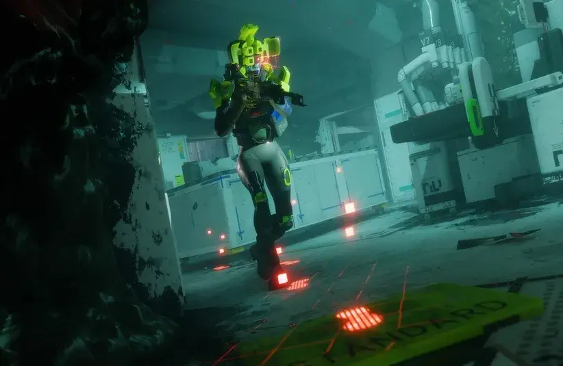
Marathon’s neon‑heavy, Linux‑terminal‑meets‑cyberpunk aesthetic has been polarizing since the first reveal, but the Server Slam turned that simmer into a boil. Players complained about:
- unreadable text mid‑fight
- multiple font sizes competing for attention
- inconsistent spacing
- menus that feel like a puzzle inside a puzzle
- HUD elements that don’t catch the eye when they need to
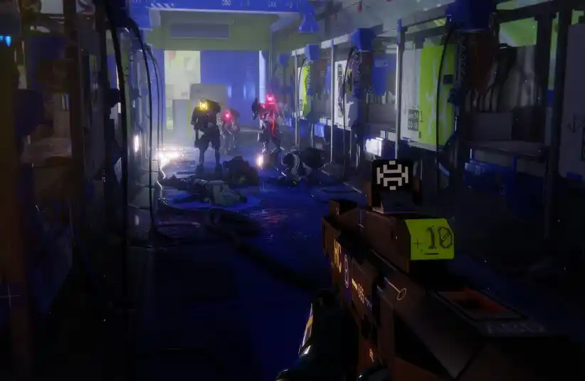
One YouTuber took one look at the menus and declared Marathon the first true “fontslop game,” a phrase that spread across X like wildfire. Others echoed the sentiment, calling the UI “confusing,” “unintuitive,” and “an absolute eyesore.”
Even Ninja chimed in, calling it “one of the most complex menus I’ve ever seen in my life.”
Bungie’s UI Designer Responds — By Calling Himself a “Fontslop Merchant”
Instead of dodging the criticism, Marathon UI designer Elliott Gray ran straight into it. His X bio now proudly reads: fontslop merchant (PC Gamer). And in a tweet that instantly became part of the game’s emerging culture, he doubled down:
“Don’t think for a second that we’re gonna remove the SAUCE from the UI.”
“#fontsloptakeover”
But he wasn’t dismissive. Gray acknowledged the real issues players raised:
- inventory management
- navigation clarity
- density of information
- readability during combat
He made it clear the team will address those pain points — but the core visual identity? The “sauce”? That’s staying.
Why Marathon’s UI Hit Players So Hard
Marathon’s UI is bold. Neon‑bold. Terminal‑bold. “Did I just open a hacker’s desktop?” bold.
And that’s exactly why it’s dividing the community.
The modern AAA multiplayer landscape has spent the last decade sanding down its interfaces into the same safe, sterile rectangles. Everything is flat. Everything is minimal. Everything is “clean.” Marathon is the opposite — loud, stylized, and aggressively committed to its aesthetic.
For some players, that’s refreshing.
For others, it’s like being slapped in the face with a typography textbook.
TheGamer noted that the UI uses “several different sizes, colors, and even fonts,” making it tough to parse in the middle of a firefight. Eurogamer highlighted how players struggled to navigate menus due to the sheer density of visual information. Eurogamer.net
But there’s a counter‑movement forming too — players who think the UI is one of the few genuinely bold design swings in modern shooters.
As one player put it:
“Gamers are such goobrained slophogs they see the only attempt at something good looking in video games in the past 20 years and their mindworms just give up.”
Bungie Isn’t Backing Down — At Least Not on Style
Bungie has acknowledged the UI feedback and confirmed that improvements are coming post‑launch. They’re tracking readability, navigation clarity, and HUD issues through the official Discord.
But the fundamental look? The neon chaos? The “sauce”?
That’s not going anywhere.
Gray’s stance is clear:
Fix the friction.
Keep the flavor.
And honestly, that tracks with Bungie’s history. Marathon is meant to feel different — not like Destiny, not like Tarkov, not like every other extraction shooter chasing the same muted UI trends.
With Launch Days Away, Don’t Expect Major UI Changes Yet
Marathon launches in just two days. There’s no universe where Bungie can overhaul the entire UI before then — nor do they seem interested in doing so. What players will get on day one is:
- the same bold, neon‑drenched UI
- some early readability tweaks
- a promise of more improvements post‑launch
- and a dev team that is very aware of the “Fontslop” discourse
If you hated the UI during the Server Slam, you’re probably going to hate it on launch day too. If you loved it, congratulations — you’re getting exactly what you wanted.
Either way, the UI has already become part of Marathon’s identity. And judging by the #fontsloptakeover energy, Bungie is leaning into it.
The Real Question Now: Will Players Adapt or Revolt?
After 21 hours with the Server Slam, some players say the UI “clicks” with time. Others say it never will. But one thing is certain: Marathon’s UI is no longer just a design choice — it’s a cultural flashpoint.
And Bungie seems perfectly happy to let the Fontslop discourse rage on.