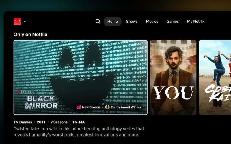
Netflix has unveiled a revamped navigation experience. The big question is whether this new Netflix navigation experience will actually be an improvement or just a big frustration for subscribers. We wondered that too. Keep reading for everything we know so far, so you can decide if this is better or worse.
The New Netflix Navigation Experience
According to Netflix, this new layout will make it easier to find something to watch. They want to keep viewers in their service longer by providing a better interface and giving you the content that you want. This is a redesign for the TV experience, so that’s smart TVs and streaming devices. It sounds like a gradual rollout starting on May 19. Mobile devices will also get some new features, so we’ll get to that later. It’s unclear if this new interface will show on mobile devices like smartphones and tablets, though.
Navigation Menu
The most prominent change is that the navigation menu is moving from the left side to the top. The new Netflix navigation experience will include a search icon, and buttons for Home, Shows, Movies, Games, and My Netflix. The search icon has the typical appearance of a magnifying glass. Selecting search will lead to the familiar categories. My Netflix is where you’ll find your list, continue watching, and the shows and movies you selected “remind me” for. (Games is still a beta on TVs, so not everyone will see it.)
Responsive Recommendations
This is probably the biggest change they announced. It sounds like the goal here is to present movies and shows that fit with your current mood. As you search and watch content, the recommendation rows on the Home page will update in real time. This could go one of two ways. If it’s as smooth as they say and you’re on the search for something new, it could be a huge improvement. If, on the other hand, it’s slow or you want to go find a title you saw listed, but it’s disappeared, that could be frustrating. This is a wait-and-see. But we’re hopeful.
In addition to the responsive recommendations, the new Netflix navigation experience adds “callouts” to the show cover art. These are interesting and are there to give you a reason for the title being recommended. They say things like “New Season,” “Emmy Award Winner,” or “Leaving Soon.”
Mobile
The information about the new Netflix navigation experience isn’t as detailed about what’s coming to mobile. But they shared a couple of things. First, there’s a vertical feed where you scroll up and down through the feed of show clips. You can add titles to your list, watch it from the feed, or share it.
They also shared that an AI search experience will be tested. It’s a “small opt-in beta” for iOS users and will let you search using more natural phrases. The example given was, “I want something funny and upbeat.” This is another one we’ll have to wait to see. It’s going to depend on tags being accurate, and we know that the tags aren’t always quite right.
Wrap Up
Overall, the changes look good. It would be great to see the new Netflix navigation in the mobile apps and website. It’s a little strange moving from one to the other and finding a completely different navigation. Still, one step at a time.
If you want to view the entire presentation, you can find it on YouTube.


